A Bad Design choice
How did a company known for design allow such UI
It is sometimes shocking what some companies will let loose in production, especially when these bad designs are by design.
An example of this is Apple’s Magic mouse (in black too), with its distinctly misplaced charging station, under the mouse, forcing the user to never charge during use.
However, somehow the UI team at Apple has done worse. Lets look at the current menu (MacOS Sequoia - 15.1.1) when one right clicks on a removable volume (USB drive, Hard Drive, SD Card…).
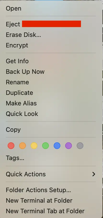
Now, in what world does one think that the buttons “Eject disk” and “Erase Disk…” belong next to each other? Were the deisgners cross-eyed? What if a user is?
This is unacceptably bad, and I hope this gets patched/changed soon.